Amy and I watched a movie on DVD yesterday and the first menu on the DVD was a language selection choice. Something struck me as odd about the list though:
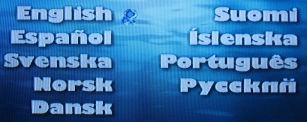
The choice in the lower right is supposed to represent Russian. In the Cyrillic script, Russian is actually written Русский (transliterated as "Russkiy"). The last two letters are ИЙ in upper case and ий in lower case. The weird mirror-image Roman n must have been the result of somebody trying desperately to bash Cyrillic letters into a Roman character set. I can't imagine a system that would render text like that by default, so they must have gone to some manual effort to specifically mirror the n. Madness!
The other letter shapes are all wrong too, especially the k which shouldn't have an ascender.
Anyway, I thought it was amusing. I'll forgive you if you don't.
2008-05-13T11:05:46Z
Though I haven't seen that for about 20 years or so; I imagine that typography has made some advances since then.
2008-05-13T17:09:30Z
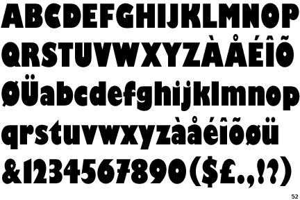 After using http://www.identifont.com/ and answering approximately 50 questions about the fonts, I was able to identify that font as Gill Kayo Condensed. That particular font does not include the Cyrillic character set, so that explains the irregular character substitutions. Presumably their graphic designer loved the font so much that they did not want to switch simply because it lacked the correct characters.
(I also tried to identify the font using http://www.whatthefont.com/, but it wasn't able to handle the complexity of the font, even after cropping the image numerous times.)
2008-05-13T19:39:34Z
2008-05-13T20:15:36Z
I learned about the existence of the Identifont, MyFonts, and WhatTheFont facilities through one of my college buddies, who happens to do the backend development for MyFonts/WhatTheFont.
2008-05-13T18:54:54Z
2008-05-13T19:39:48Z
2008-05-18T06:51:12Z
2008-05-13T11:03:56Z