okay, okay, I get it!
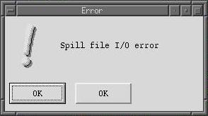
A cow-orker got this error dialog today and I had to share:

This was Visual Slickedit on Linux. And, pressing either OK button didn't help because the same message immediately popped up again.
Do window managers on Linux still look this ugly in 2008?
2008-08-29T14:41:02Z
No kidding gah... I don't remember DOS GUIs looking this bad but it has been a while.
2008-08-29T19:58:26Z
I don't really know, I don't use gui stuff on linux. My workspace at work, as you might expect, is vim running inside screen inside putty on Windows XP. :)
If you try say, the latest version of Ubuntu, it sure looks a lot better than that dialog I posted.
If you try say, the latest version of Ubuntu, it sure looks a lot better than that dialog I posted.
2008-08-29T13:57:35Z
A few weeks ago Windows gave us an error popup with just 3 words and 2 buttons:
Error
[Yes] [No]
At least the buttons weren't the same... :)
Error
[Yes] [No]
At least the buttons weren't the same... :)
2008-08-29T16:01:38Z
You should submit this to The Daily WTF. They like this sort of thing.
2008-08-29T13:45:49Z